Eurofishmarket is a consultancy company that focuses on research, training and information within the European fishing market. We have curated their Editorial line of magazines for over 6 years.
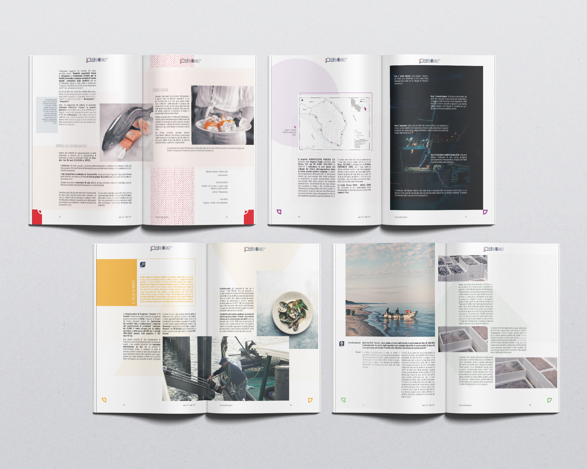
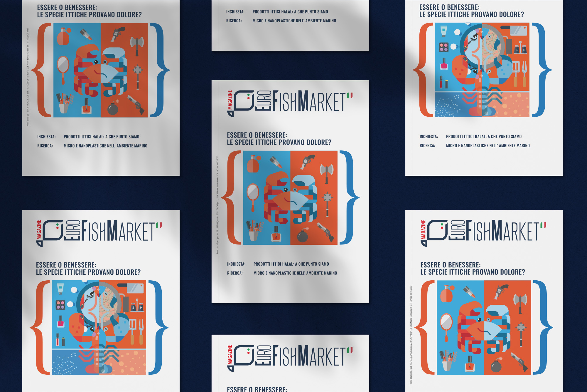
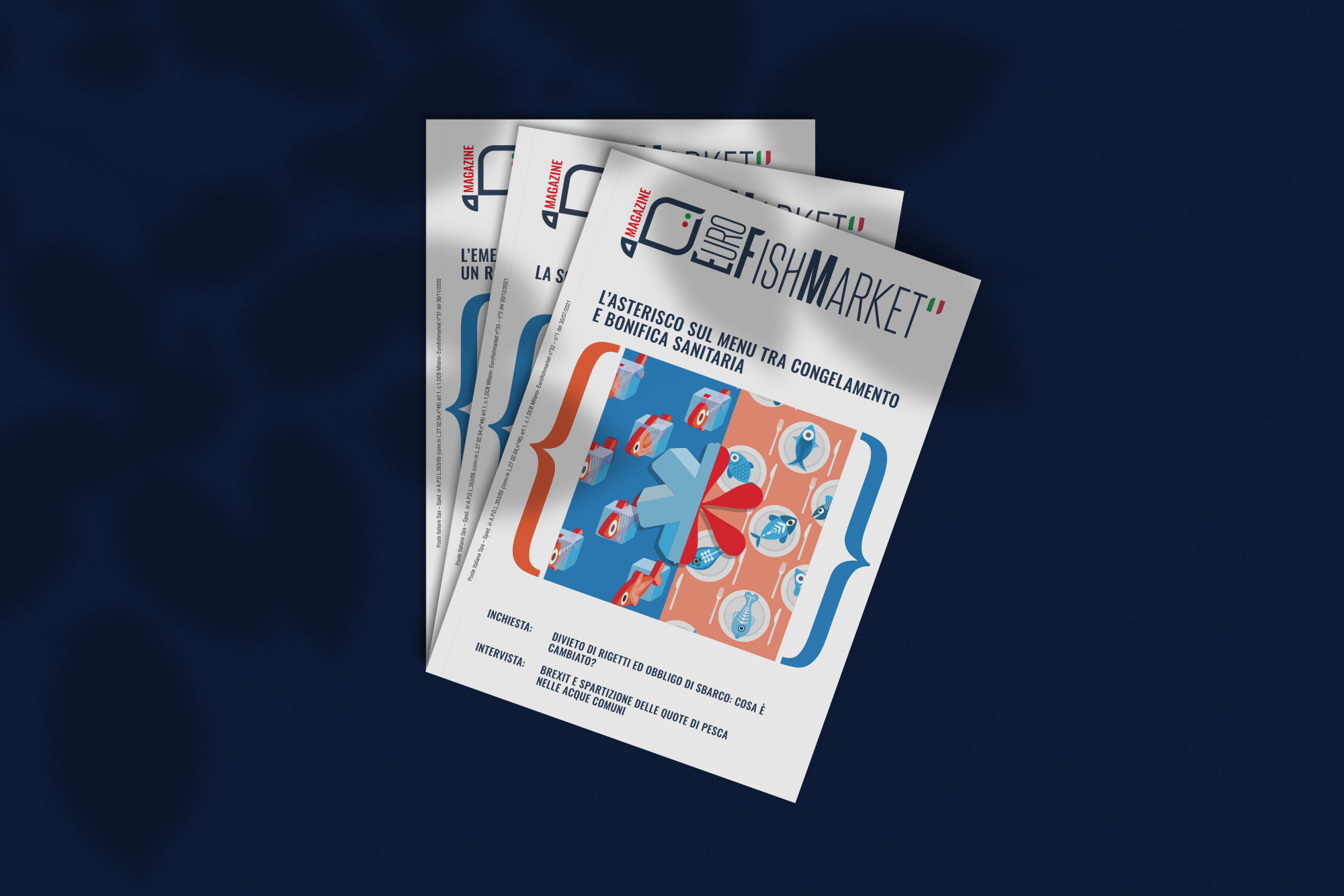
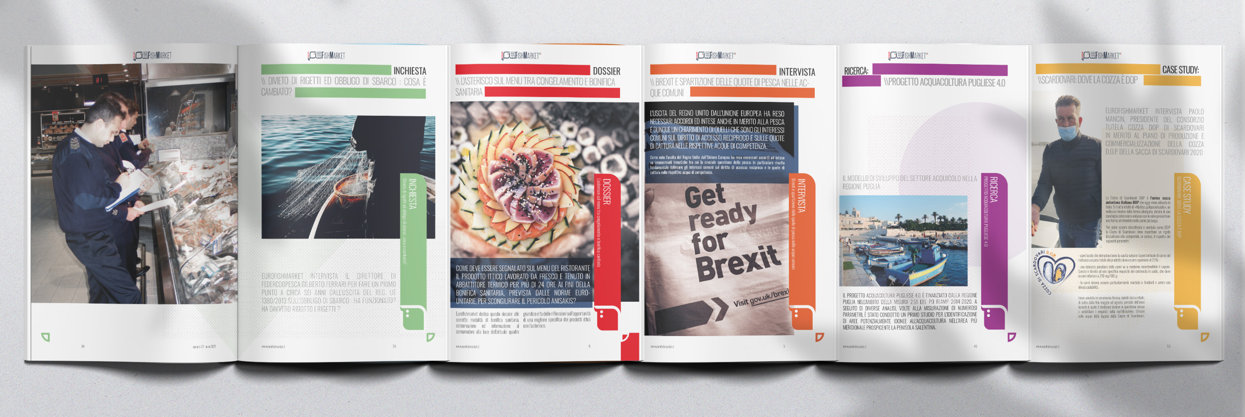
We created an editorial line following a distinct style and created illustrations using a vibrant color pallet with a slightly ironic approach to the visual storytelling to represent the (sometimes) difficult or research heavy articles and topics. We designed a unique illustration for every cover and also smaller illustrations to integrate inside various articles to represent the argument discussed in each addition. The brand design included a freshening up of the full Eurofishmarket logo, abbreviated logo mark and an icon set custom made to identify specific arguments within each article.
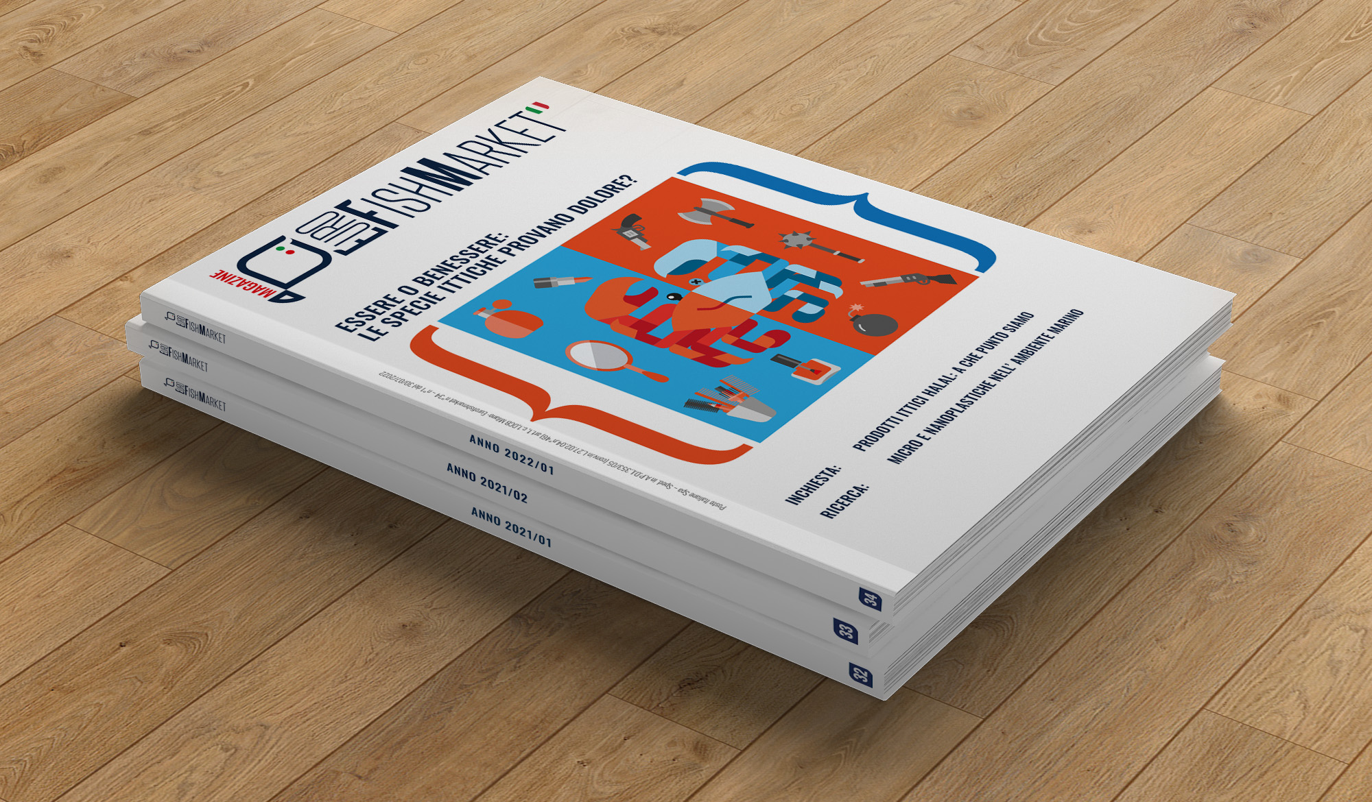

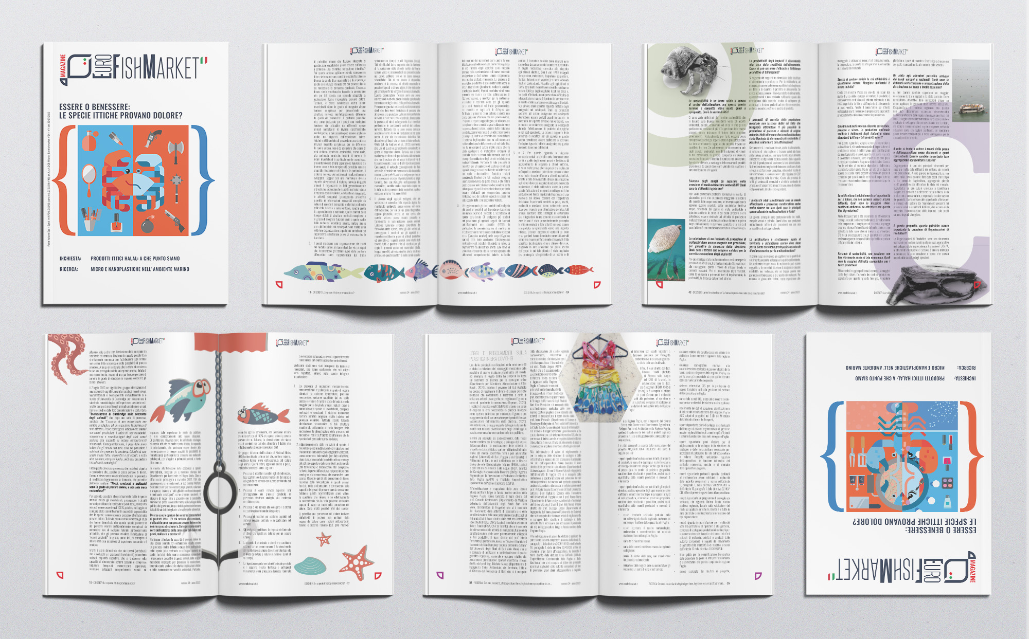
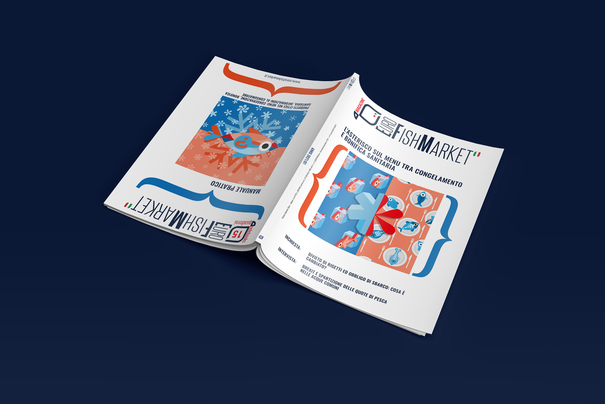
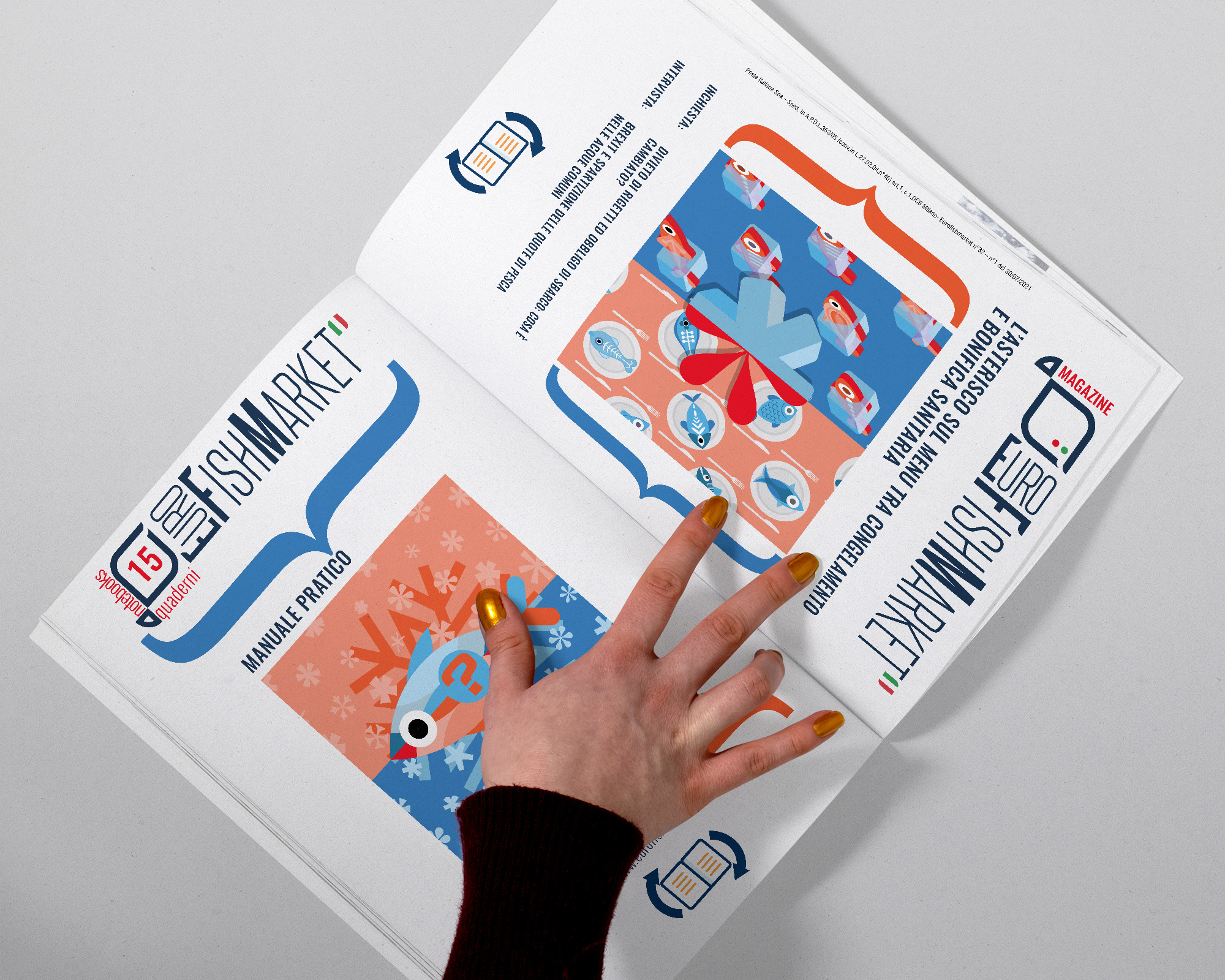
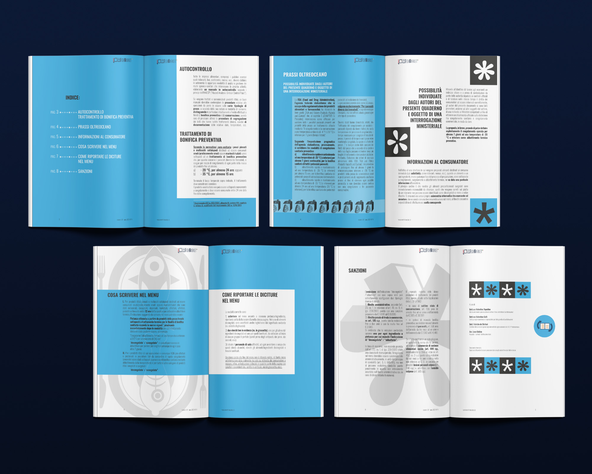
Each magazine is accompanied by a technical, legal or training notebook specifically based on the arguments discussed in the edition. We created a clear distinction between these two halves by flipping the pages of the notebook upside-down and sometimes even sideways, depending on the content. In this way the front and back labels are inverted so that you can begin reading the magazine from one end or the technical notebook from the other. Furthermore, this allows the notebook to be separated from the magazine itself to become an operational material for those who work everyday in the fishing industry.
