Beyond Design?
Our History
We have always been graphic designers, tasked with building visual identities for what the market needs. Whether it is an institution, an event, a cultural trend, an associative movement, or a community service.
The brand becomes an icon and a concept for a service and why not! The Logo and its variations are transformed into a patent, they help the intangible to take shape and exist. And as always the brand helps communicate, aggregate and sell.
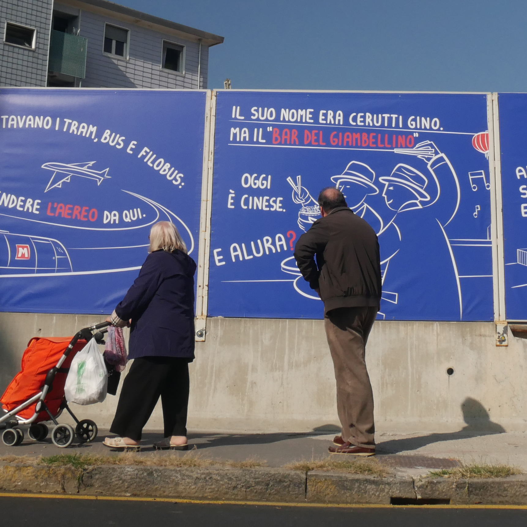
MM4 – Milan Metro
Competition for the dressing of the M4 construction sites in Milan with final exhibition at the Milan Triennale.
We were entrusted with the Giambellino/Lorenteggio district, an unsurpassed champion of the Milanese mentality that is open and curious about life. Where tastes, styles, nationalities and social classes blend together with a mix that has always made it a unique area: a human construction site in constant transformation.
[special stop] is the tribute we wanted to pay to this neighborhood.
/ Milan, the city ready to realize what others consider speculation or a dream /

Branding, Graphic Declination and layout: 63DE-SIGN | Illustration: Lele Gastini | Copywriting and Concept: Paolo Rumi
Cantiere – Leed Platinum per la sostenibilità
A seguito di una conferma sulle certificazioni LEED dei Building ancora in costruzione presso l’Energy Park, SEGRO ha voluto brandizzare il perimetro del cantiere. L’ obiettivo è quello di rafforzare l’immagine già vincente di un complesso lavorativo destinato non solo ad ottimizzare l’aspetto architettonico ed energetico degli uffici, ma anche la cura verso il benessere delle persone che li abitano e lo studio di aree dedicate alla libera aggregazione e ricreazione.
/ Il rivestimento del cantiere offre la visione del progetto immobiliare sottolineando ogni aspetto di sostenibilità usato per la sua costruzione /
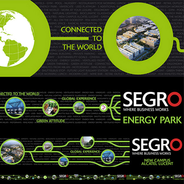
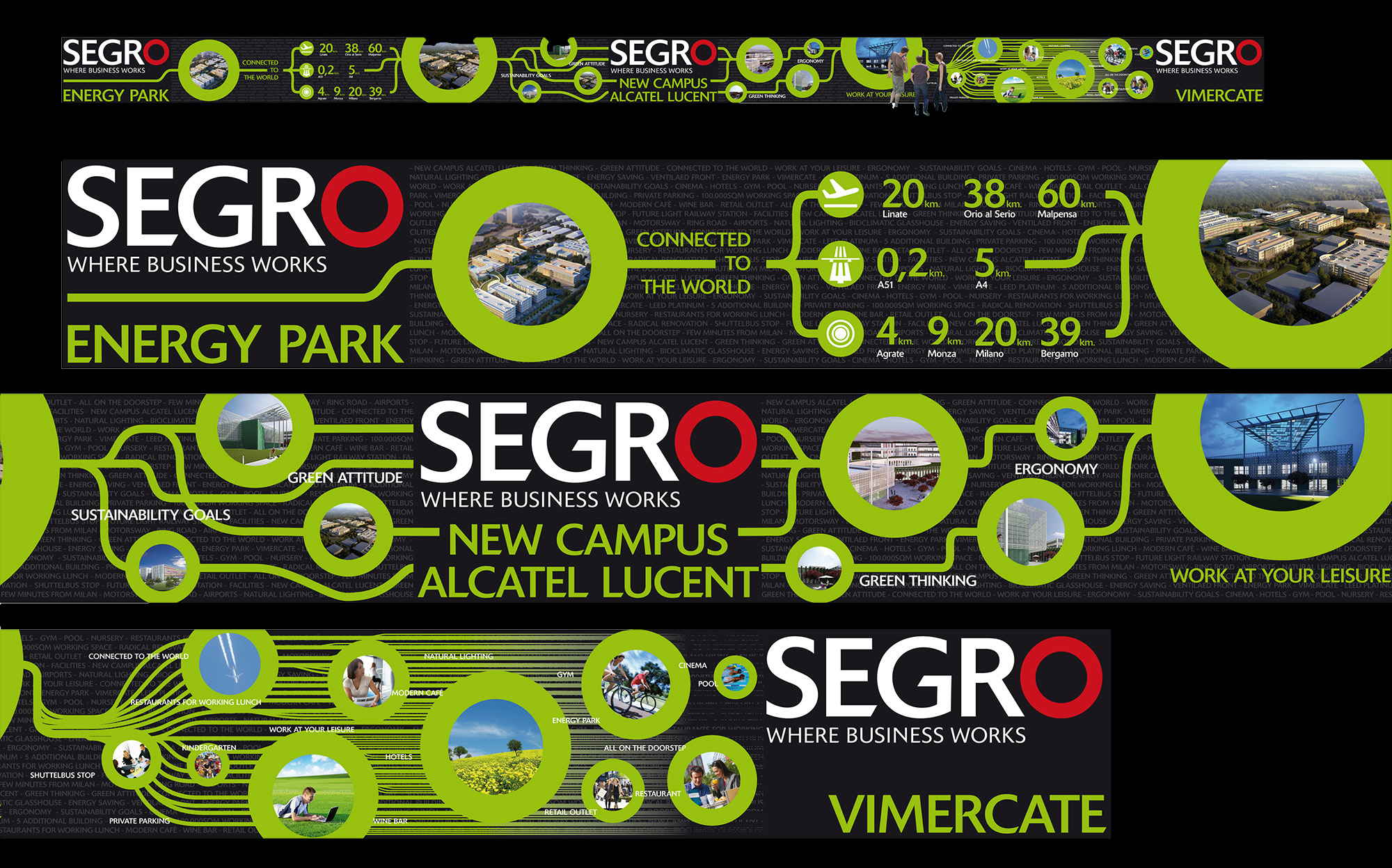

Branding and Graphic Declination: 63DE-SIGN
SEGRO ENERGY PARK
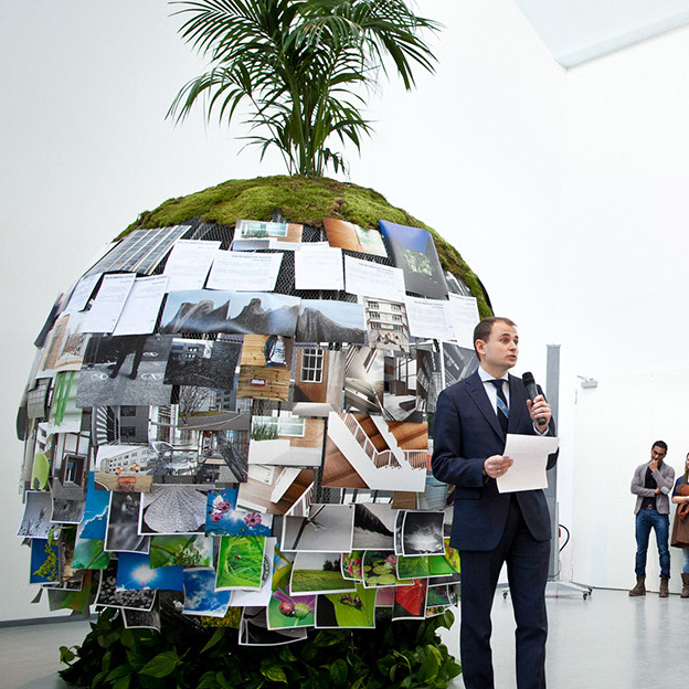
The English Trust won the first European LEED PLATINUM certification with the project of Building 03 of the Energy Park in Vimercate. SEGRO organized a photographic contest to crown this important recognition and to raise awareness among talented young university students of environmental issues and stimulate their potential creativity. The design included the coordinated image for the award event, the artistic installation at the Milan Triennale, the photo contest website including invitations, certificates and final book.
The exhibition was centered around an iron world frame covered with plants. The photos taken and sent by the contest’s participants were overlayed onto this green world.
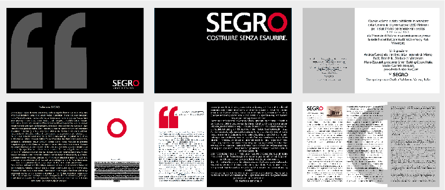
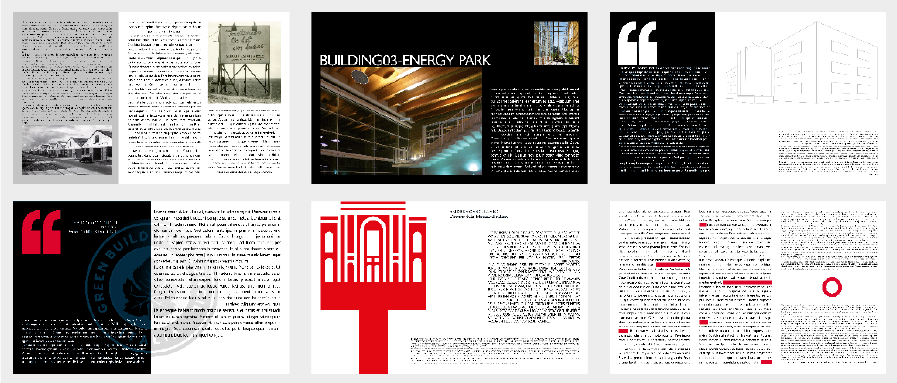
In partnership with Michela Bottaro Agency | Concept Award, Branding and Graphic Declination, Installation Study: 63DE-SIGN
…ma così è la vita!
the design that breaks down barriers
We studied, for Paolo Cocchio’s association, the information campaign for AICH Onlus Milano, the association that, since 1979, has brought together the family members of people affected by Huntington’s disease. “…ma così è la vita!”, was not only an awareness project, but also a Design For All. A project that involved the students of the Milan Polytechnic, industrial designers section.
The main objective of the project was to use creativity and innovation to create objects that can be used in everyday life, in order to make it not only easier, but also aesthetic and pleasant, both for Huntington’s patients and their families.
/ Sometimes, a few simple tricks can make the life of people with disabilities much more bearable /
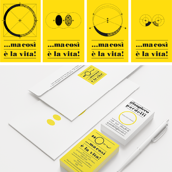
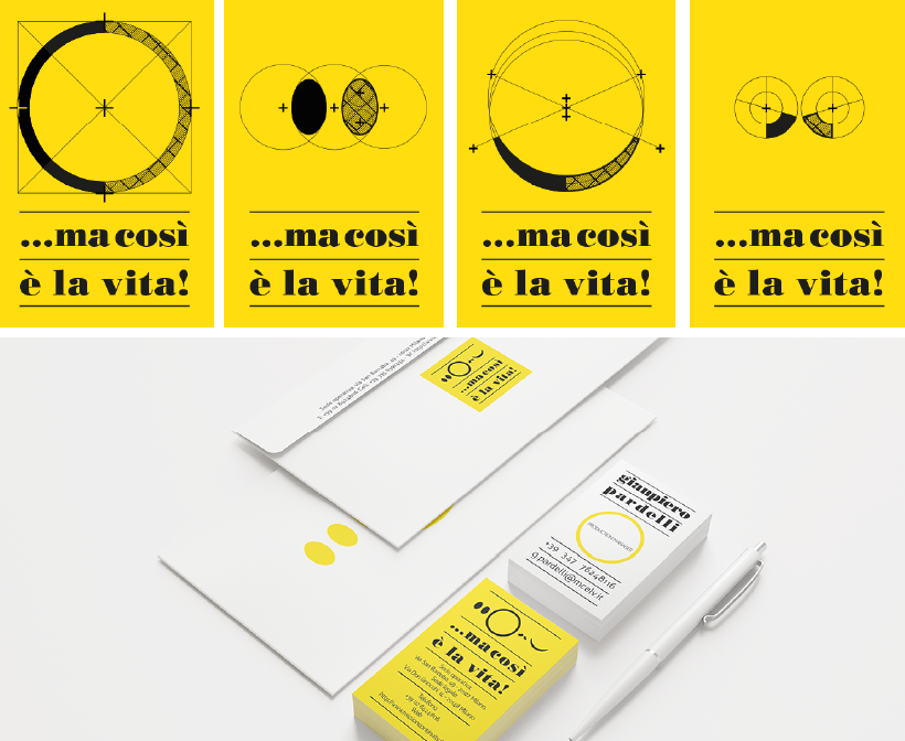

Concept, Naming, Branding and Graphic Declination: 63DE-SIGN
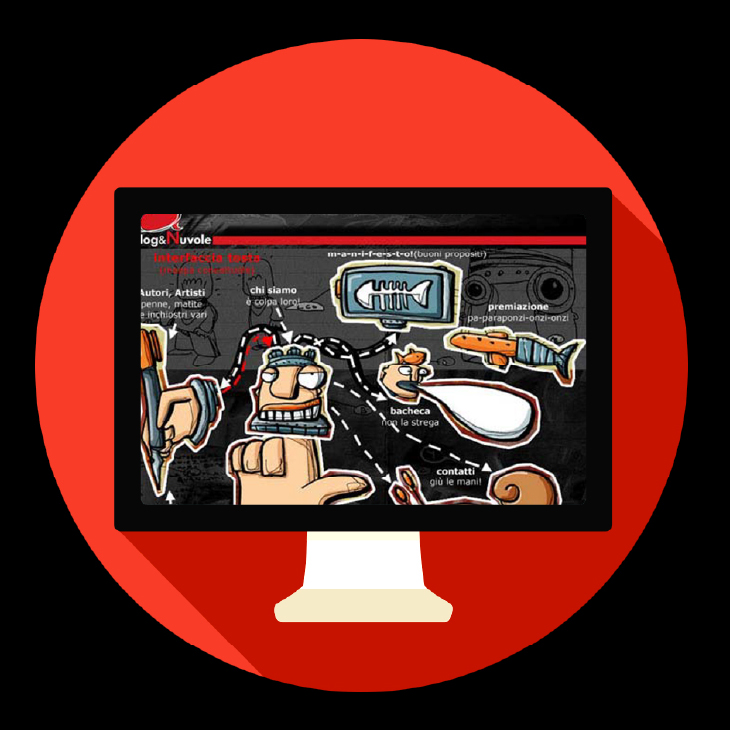
Blog & Nuvole
A certain type of short writing of literary blogs met the expert hand of famous cartoonists, giving new opportunities to the phenomenon of authorial Graphic Novels. The space of a blog, free from any belonging identity and experimental in the interpretative language, made the project spontaneously collective.
The first Triennale project on a digital platform, it received an award at the Milan Triennale and subsequently, due to its success, also became an urban exhibition at the Columns of San Lorenzo by the Lombardy Region which transformed the concept into a project of professional training.
/ Sharing of about 500 unique contacts with 380 mentions on blogs and websites per day /
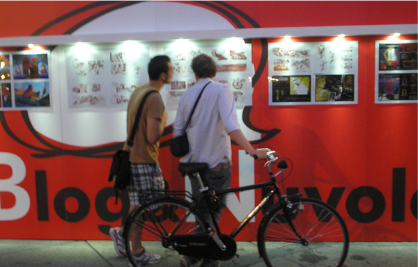
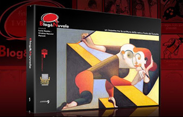
Curators: Lucia Saetta and Cristina Vannini Parenti | Sponsored by La Triennale di Milano | With the support of the Fondazione Cologni dei Mestieri d’Arte | Branding and Graphic Declination: 63DE-SIGN
100MILA RIPARTENZE
Entrepreneurs Association
The Association was born with the intention of extending a hand to all entrepreneurs who, having failed in the course of their company, find themselves having to restart. Failure creates a state of confusion and great insecurity in any professional.
Instead, any entrepreneurial failure can turn into an opportunity for improvement and growth. Especially when converted to the creation of communication materials with the study of the logo, fonts, and templates for news letters or brochures. All of this to emphasize reliability.
/ The importance of the design is a message of reliability /
Branding and Graphic Declination: 63DE-SIGN
crescere – welfare 2.0
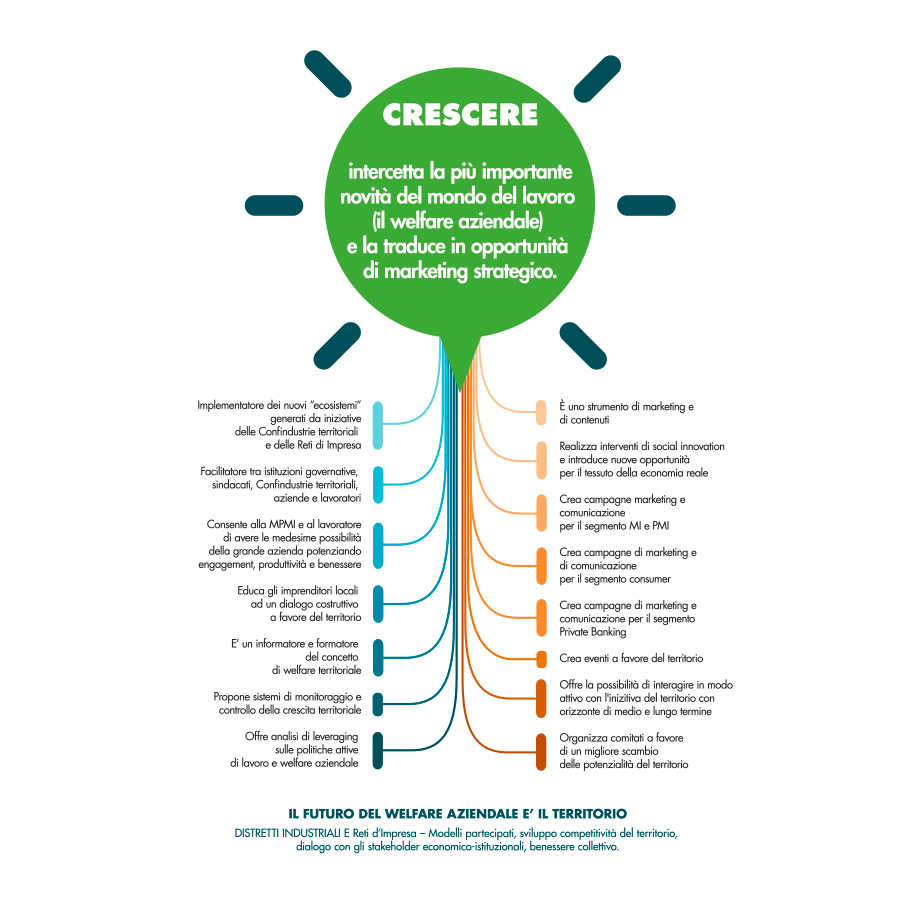
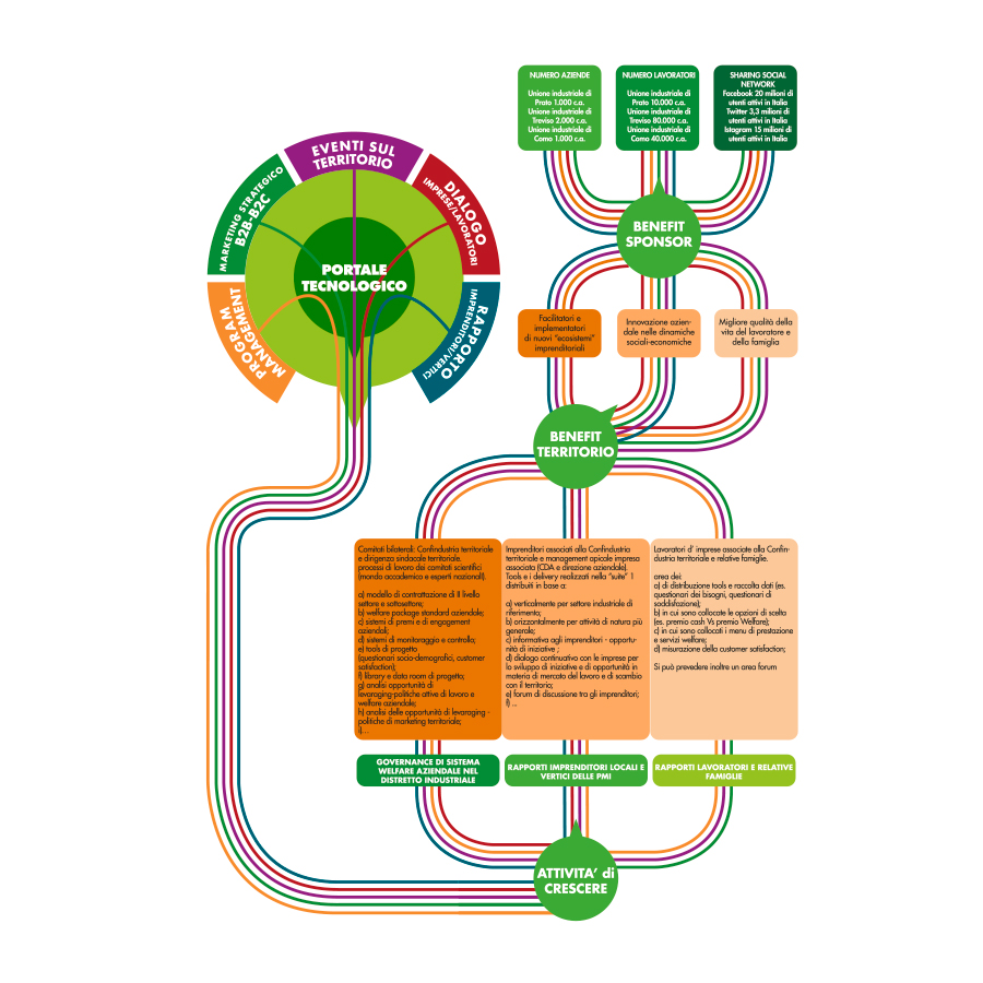
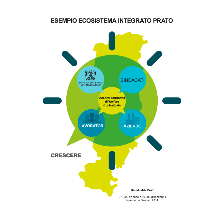
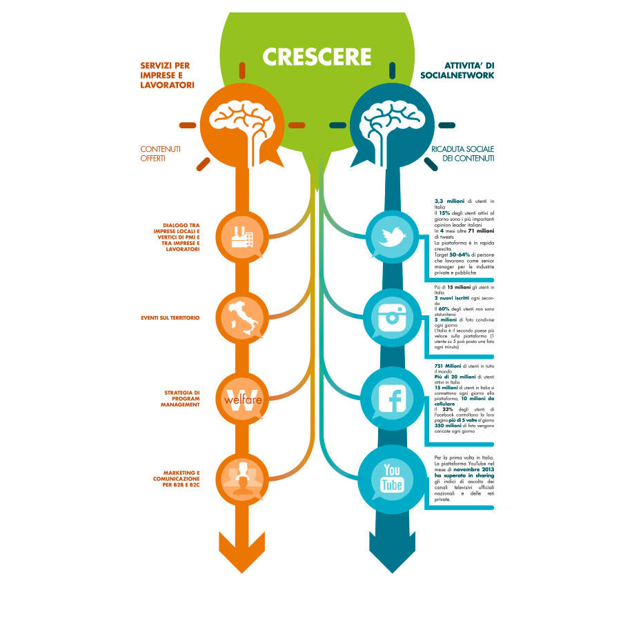
Crescere 2.0 was a corporate welfare project designed by experts to bring together 50 lawn companies in a network of incentives and support for the employees of the companies themselves. A network made up of a set of initiatives, goods and services to increase their well-being and promote the reconciliation between private and professional life.
In order to obtain funding to start the welfare model, the promoter of the Municipality of Prato contacted us for the study of a logo and the development of explanatory infographics.
Edited by: Angelo De Filippo – Close2U | Trust: Cariplo Foundation | Branding and infographic declination: 63DE-SIGN

